
“Timeless” design is pretty synonymous with clean, simple, minimalist design. And timeless design is often the primary aim for a logo designer.
For examples of what I mean, think of IBM’s Rebus design, Nasa’s worm logotype, McDonald’s golden arches, Milwaukee Brewers baseball glove and ball, the London Underground, I [heart] NY, PBS, the Co-op clover, and more. See the work of Chermayeff & Geismar & Haviv for a portfolio full of timeless, minimal logos.

Timeless, minimal, beautiful logos across time and industry.
These are all bold, clean logos that can scale to any size and maintain meaning, recognizability, and legibility. By reducing an idea or shape down to its most simple form, the mark becomes expansive in application and memorable in peoples’ minds.
But when you look at some simple logos you might be thinking “is that it?” And it’s a fair question! Minimalist design can become too simple, too generic. In reducing an idea down to a few shapes, we might have lost hold of the idea itself.
Let’s look at 3 examples where the idea was lost in the simplification process.
Paris 2024 Olympics

Paris 2024 logo on the left. Stock logo on the right I found in 2 seconds searching “free beauty salon logo” – no joke.
The idea(s): a gold medal, the Olympic flame, and Marianne (“the personification of the French Republic”) i.e., a woman’s face.
You can see all three ideas reflected in the mark. But my biggest criticism is that the flame is made in the negative space. So, our eyes and brain take in the main shape first, which is the “hair” of Marianne. And that shape is just not enough to mean anything. Also, once the logo appears in any colour other than gold, the nod to the gold medal is completely lost – so for most people it feels like their logo is a really (really) simplified face of a woman. My favourite online feedback is that it looks “like a generic beauty salon logo”. And isn’t that just what the organizers of the largest international athletic event in the world are going for?
To give credit where it’s due, the rest of the branding for Paris 2024 looks incredible, and I’m obsessed with their pictograms. But their logo is an example of becoming generic in the pursuit of simplicity.
Taco Bell

Taco Bell’s logo evolution.
The idea: keep the bell from the past logos but “elevate” it to become iconic and appeal to so-called savvy millennials.
The best comment I found on this rebrand is that the icon and the text look like two different logos. That’s exactly where the disconnect is for me – the muted colour palette of the bell sits uncomfortably atop the black, bolded typeface. Is there any meaning in this logo anymore? Anything at all? There is no nod to Mexican cuisine, no nod to the informality of their industry, and most importantly, no new personality to grab a hold of. We lose the fun, playful vibes and get nothing in return.
Now, similar to the first example, the rest of the branding for Taco Bell is quite good. It’s like they needed to create a logo so basic that they could feel free to make the brand patterns, secondary colour palette, and packaging as novel and fun as possible. But their logo is an example of becoming personality-less in the pursuit of simplicity.
Mountain Equipment Co-op (Company)
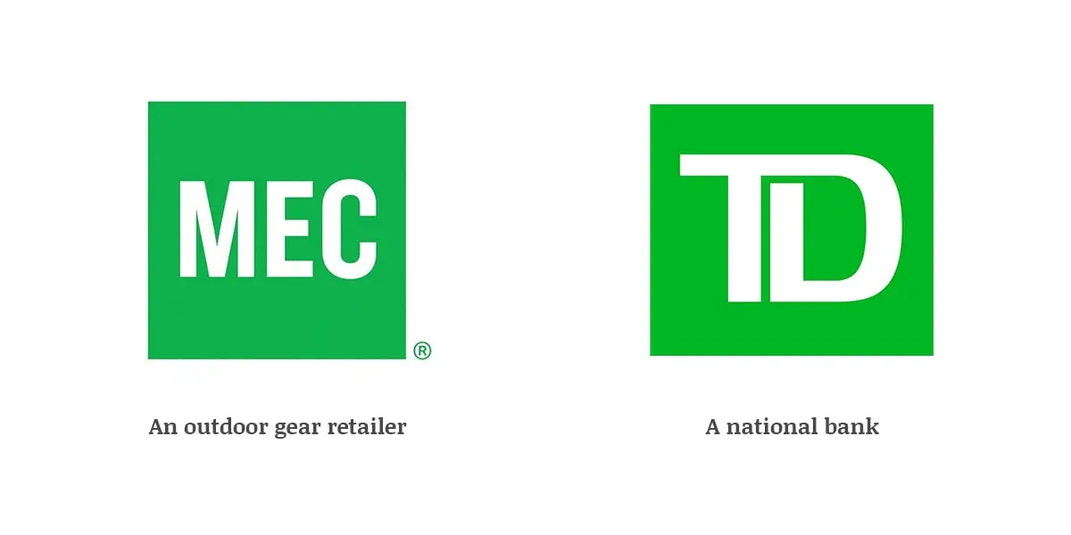
So basic even your national bank would love it.
The idea: ditch the mountain to appeal to “wellness types” who are intimidated by outdoor activities.
When MEC rolled out their new logo in 2013 I thought it was a joke. No rational person would take a logo that had as much brand caché as they did and throw it away. NO ONE. Canadians could recognize other Canadians around the world not by a flag stitched on their gear but by the MEC logo of their bag. That is bananas! Brands dream of having that kind of recognizability. But it wasn’t a joke, and for 8 years they tried to convince us a green square had meaning — until the mountain was brought back in 2021. Credit to whoever made that happen.
Rant aside, the new logo never made any sense design-wise. A green square with the initials “MEC” in it was meant to capture a brand the promotes wellness, activity, adventure, movement, nature? A square? This is a shape that exemplifies ideas of immovability, same-ness, and predictability so much that a national bank uses something very similar for their logo.
There was no saving grace with that logo. It was an example of becoming something-you-are-not in the pursuit of simplicity.
Conclusion
The examples above are a warning that though the pursuit of simplicity is often the goal of logo design, there is a needle to thread in order to keep the core idea or personality of the brand alive even as you edit. Too much editing, or editing in the wrong way, and you may arrive at a logo that is generic, personality-less, or worse, conveying something-you-are-not.