
We all know Nike and Apple are the brands to point to when you want to applaud the role of design in a company. But most businesses aren’t aspiring to such a global reach, nor do they have the kind of early-to-market advantages that those companies had.
These days businesses might be feeling like every visual motif, viral trend, and marketing innovation has been done already. And that’s if they even have a budget for such things!
But what often gets overlooked – in a mid-size business specifically – is the power of a well-designed brand. Brand and culture are the default competitive advantages of every company after all.
But what does a well-designed brand even look like? Let’s dive into some examples.
Warby Parker
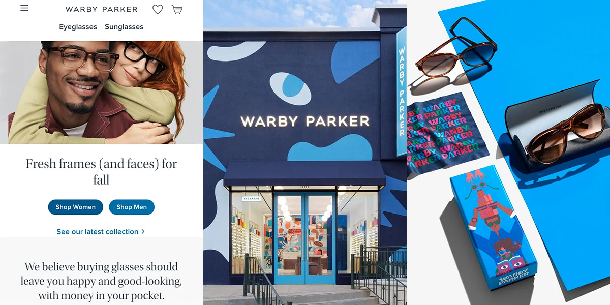
Website, stores, and packaging work independently and still create a unified brand experience. Lovely.
This golden child of DTC (direct to consumer) start-ups did everything right to create a brand with multiple emotional, branded touchpoints for their customers.
Website
The website establishes the elegance and cool factor of the brand, acting as a touchpoint for the broad strokes of brand messaging. They sell affordable glasses but nothing about the high-quality photographs, rich typographic choices, and smart copywriting implies a cheap brand.
Stores
Brick-and-mortar stores are rolled out to key cities and use playful, individualistic murals to disrupt the expectations that foot-traffic might have for a glasses store. They create interest and delight to any building they take over, not to mention a recognizable identity for each city. I.e., they have “Oh, that’s the Portland store” -style recognizability across markets.
Packaging
Packaging for Warby Parker combines the 2 approaches above, leaning heavily on the brand blue and smart copywriting and then peppering in custom illustrations and icons to add quirk and charm.
What’s important to get out of this example is that these 3 things – website, storefront, and packaging – are things that most businesses must invest in. These aren’t unique strategies or nice-to-have marketing add-ons. So, what’s stopping businesses from creating a delightful experience across digital and IRL just like Warby Parker has done?
Hootsuite
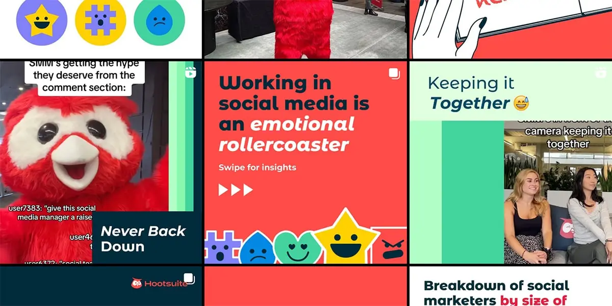
Branded messages to your target market. This is the way.
This Vancouver tech juggernaut rebranded a few years ago and since then have been hyper-focused on their target market: Social Media Managers (SMMs). We all know that bosses aren’t picking which tool the SMM uses to schedule and plan the content, the SMMs are. So, Hootsuite wisely started creating content that spoke specifically to that group.
Marketing + Target Market
By knowing exactly who they are speaking to Hootsuite can create effective, targeted content with varying degrees of lift (i.e., investment). While we aren’t taking a deep dive into marketing strategies, it’s worth noting what an incredible job this company is doing simply because they got hyper-specific on who buys their product. In this case, it’s an under appreciated but highly influential employee within a business, the SMM.
Once you know who you’re talking to you’d be surprised how quickly messaging flows.
Design + Marketing
Hootsuite leverages bold colours and cute symbols of social media – plus their expressive mascot Owly – to ensure that SMMs don’t lose sight of who the ally in their corner is. Videos, tips & tricks, and the impressive Career Report are all heavily branded pieces of content, ensuring that any widespread sharing is an organic (and unpaid) marketing experience.
If there is one North Star in the pursuit of a well-designed brand it’s consistency. Hootsuite shows that by being consistent in who they are targeting with their messaging, and by being consistent in branding every single bit of digital content they release, they are securing themselves in the minds of those who buy – or could buy – their product.
Figma
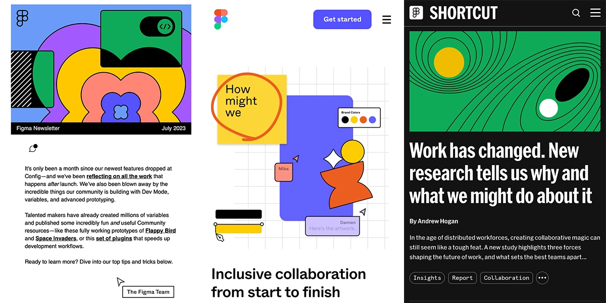
Say it with me now: Consistency!
This online design platform disrupted the industry with its innovation and functionality. But they locked themselves into the designer zeitgeist by crafting a strong, compelling brand – the currency of the profession.
Build beyond the logo
Figma’s logo is excellently crafted, but the visual language of the newsletters, website, and social media posts is what builds the branding in our minds. Saturated colours, thick black lines, and chunky cursors jump off the screen. An endless scroll through Twitter is easily halted with a glance of one of their posts thanks to the striking graphics. I don’t often read their newsletters, but I always open them to enjoy the visuals. They have built a brand dictionary full of visuals so that the logo rarely needs to be included for a viewer to know “oh that’s Figma”. This should be the goal of any online brand.
Online but never off brand
Online brands might feel like they miss out on the storefront experience as a means of communicating the brand to their customers, but the online world provides plenty of touchpoints if you’re dogged enough to exploit them all. Each page of the website, each stage of your sales funnel, every tweet, post, and article, every newsletter from top to bottom. Figma squeezes every visual moment out of these touchpoints, creating such a wholistic brand experience that they have some of the most vocal and rabid brand loyalists around.
A well-designed brand squeezes every ounce of brand caché out of every interaction with a customer or potential customer. That means moving well beyond having just a logo to visually articulate your brand, it means being obsessive with identifying opportunities to use that language again and again.
Conclusion
What does a well-designed brand even look like? It looks like:
- Leveraging your website, packaging, and storefront to meet customers where they are in those moments. Find and craft the unique brand opportunities each medium allows you while still creating a cohesive over-arching look and feel.
- Consistently messaging to your target market specifically through your visual language, creating a presence in the minds of those who actually buy your product/service.
- Expanding your brand to become an entire dictionary of visual language you can use in every single moment of customer interaction. It only feels repetitive if you have a small or underdeveloped visual vocabulary.